Website copywriting example for a design agency
This website copywriting example is about using your website copy to agitate an experienced potential client’s pain or to teach an inexperienced prospect about the problems you solve.
Packaging is part of our everyday life, but we hardly ever stop to think about it. That is unless you’re a product manager or owner of a consumer product business. In that case, packaging might be on your mind plenty. Those people are exactly the type of clients Mela Creative hopes to convert with their website.
Mela Creative designs packaging for products on shelves. The agency came to the Sydney website copywriters at Taleist for help writing a website that served three purposes:
- Mela Creative wanted their website to focus on their expertise in packaging design.
- The agency wanted the site to mention they offer other design and branding services.
- The agency wanted their website to educate the reader about the importance of hiring a designer who specialises in packaging design. (Because many designers can make something look good on screen, but those designs won’t necessarily work on a shelf.)
[toc]
Using the website to highlight the client’s pain
Products are generally in a zero-sum situation: the consumer either picks up your product or a competitor’s product. The customer isn’t going to buy your sundried tomatoes and the other guy’s.
In your ad, your product is the hero. It’s shown alone; there’s no sign of another brand. On the shelf, however, your product sits next to all the competition. Whether your product gets picked up comes down in large part to packaging design.
It’s called “shelf impact”. And the copywriting on this website needed to teach the reader that saving pennies on design could mean losing the farm in sales.
1. Headline that highlights the value proposition

The headline tells readers who Mela is and what they do. Thanks to a crystal clear positioning statement, Mela’s ideal clients know right away they’re at a packaging design agency’s website. (Failure to orientate readers immediately is a common failing of website copywriting, which is why it’s one of our seven easy conversion optimisation tips.)
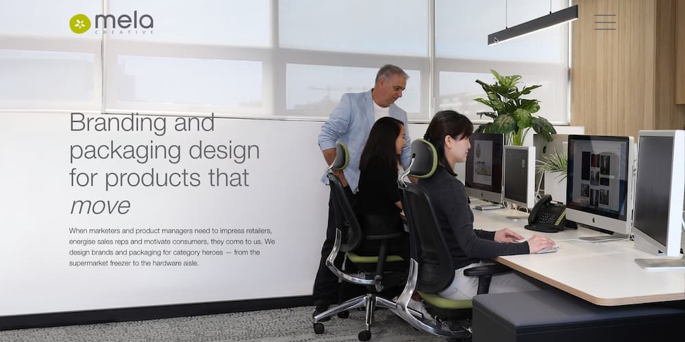
Branding and packaging design for products that move
An example of a clear positioning statement on a webpage
The headline also paints a picture of the benefit prospects will receive with Mela — their products will MOVE off the shelf. (The copywriter’s choice to render move in italics, suggesting flow, is a nice visual reinforcement of the idea of movement.)
2. A secret handshake above the fold
When marketers and product managers need to impress retailers, energise sales reps and motivate consumers, they come to us.
This inside-baseball reference tells readers they’re on the site of someone who understands them
There might be nothing about this copy that stands out to you. To Mela’s ideal client, however, there’s a message hidden in the copy.
Product managers pass their products to sales reps. Sales reps take the products on the road, showing them to the buyers for stores. The buyers place order, orders that determine the success of the product.
Every product manager knows sales reps will be more excited about some products than others. The products they’re more excited about will get pushed harder and get more orders.
If Mela’s packaging gets sales reps “energised”, that’s good news for the product manager. And only a designer with deep retail industry knowledge would know that good packaging design doesn’t motivate only consumers .
This secret handshake says, We‘re one of you.
3. Considered use of jargon in copywriting
We design brands and packaging for category heroes.
Sometimes a little jargon is more than okay
Good copywriters hack out jargon. Most of the time. However, jargon is sometimes another kind of secret handshake. Well-used, jargon can signal to prospects that we understand their business. That’s why Mela Creative’s website copy has a a sprinkle of jargon like “category hero” in the example above.
When you’re walking up and down the aisles, you probably wouldn’t single out one product as a “category hero”. That’s exactly why we use the phrase here. Only those deep on the inside of retail would casually throw that term into a conversation.
4. Using the copy to highlight added value and build an argument for greater up-front investment

Consumer products companies will often extend their product. The yoghurt brand you’re designing today might one day be packaged with a pocket of cereal or fruit or who-knows-what.
If this known unknown isn’t considered from the outset, an extension might require a completely new design. So yes, choosing an experienced designer might cost a little more, but a little extra investment now could save you a world of cost and hassle down the line.
Marketers and product managers trust us to design brands that will fit their product’s present and future — attention-grabbing today and expandable to brand extensions not yet imagined.
A knowledgeable client will realise that language like this could come only from an insider
“Brand extension” is another example of using jargon judiciously. “Extension” might mean nothing to you in this context, but it will pop for Mela’s ideal reader. And it’s not language they’ll find on a generic designer’s website.
Are you looking for brand designers with the right questions and the creative skill to work with you to create lasting shelf impact?
Building an argument for the greater investment in specialists
Throughout the website copy, our copywriters are building an argument. The argument is that it’s prudent to invest in Mela. That’s because Mela’s approach to packaging design will save prospects a fortune in the long run. Looking through this site, you’ll see this argument made and reinforced in a dozen different ways.
5. Website imagery that reflects the values of the company

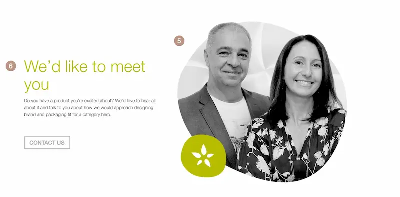
Here, the website features a real picture of Mela’s owners, Emanuel Mazzucco and Rosanna Mazzucco. The image is friendly and approachable. It reflects the impression Mela will make on its ideal clients in person. (Rather than the stereotype of too-cool designers who make their clients feel ordinary.)
6. A call to action in the homepage
Not all website traffic comes from cold from Google or social media ads. For some businesses, referrals can be a huge source of traffic as well. These referrals might scroll through the website’s homepage just to confirm the business offers the services they’ve been told they offer.
So why make this referral traffic go somewhere else on the site to take action? Having a call to action on your homepage allows these prospects take action right away if they’ve seen enough.
We’d like to meet you.
We’d love to hear all about it and talk to you about how we would approach designing brand and packaging fit for a category hero.
This language is welcoming, and it’s not trying to promote anything that might sound salesy, like a “discovery call” or “brand strategy session”
This call to action stays true to the company’s brand. The content is welcoming and invites a conversation with prospective clients. The overall effect is that you’d be calling for a chat, not a pitch.
This call to action also addresses a client objection — Designers may look down on less-than-glamorous products (and their owners). Instead, these words are warm. They convey excitement to discuss prospects’ products, no matter what those products are.
7. An About Us page that paints a picture

We have plenty to say about writing the perfect About Us page, and we’ve collected plenty of examples of small business About Us pages. And in this example of an About Us page for a design agency, we got to to practise what we preach.
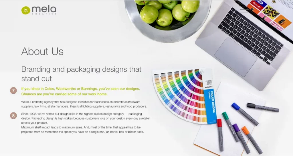
If you shop in Coles, Woolworths or Bunnings, you’ve seen our designs.
Name-dropping to build authority — in Australia, these are massive retail chains
The subheading above the fold of this About page is visual. It paints a picture in prospects’ minds of Mela Creative’s designs sitting on the shelves of well-known chain stores. The first line of the copy colours in that picture — you’re in the store looking at the agency’s design work.
The website copywriting on this About page also builds authority. The copy name-drops three of the biggest chains in the country.
The copy further develops the idea raised on the homepage — the idea of having products that move. The web copy emphasises that the main goal is not to have the most beautiful package design on the shelf. Stopping at being beautiful is a mistake lesser designers might make. Mela, on the other hand, knows the main goal is to have a package design that convinces consumers to pick up the product and carry it home.
Chances are you’ve carried some of our work home.
The copy reinforces that the designer knows that the point is not a beautiful design. The point is to get those products picked off the
shelf.
The copywriter of this page, Steven Lewis, breaks down the copywriting of Mela’s About Us page in this video…
8. Web copy that raises the stakes
One of the challenges Mela faces is their services that cost more than the average designer. As copywriters, we countered that challenge by reinforcing Mela’s value proposition.
Our goal with this copy is to help prospects realise they’re not paying a premium only for a good package design. They’re paying the premium for the experience and expertise of a packaging designer dedicated to selling their products.
One of the ways our copywriting does this on the website is by reminding prospects that packaging design is a high-stakes game.
Packaging design is high-stakes because customers vote on your design every day a retailer stocks your product.
Reminding the reader why saving pennies on design could be an expensive mistake. Note the subtle reminder that retailers stop ordering lines that don’t move — “every day a retailer stocks your product”.
As we said above, retailing products is a zero-sum game. Either a consumer will pick up your product or they will choose your competitor’s product. This website copywriting example highlights the importance of having packaging that stands out.
Maximum shelf impact leads to maximum sales.
Most of the time, that appeal has to be projected from no more than the space you have on a single can, jar, bottle, box or blister pack.
A good example of problem agitation in web copy
“Shelf impact” is a commonly used term in the consumer product industry. So this website copywriting is another example of using jargon sparingly to demonstrate insider credentials.
9. Making the client’s problem vivid in website copywriting

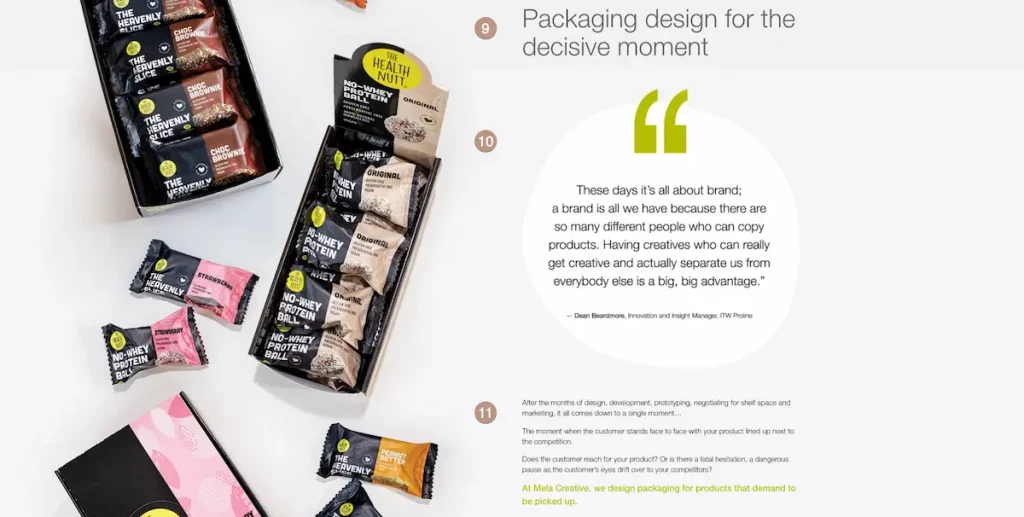
Packaging design for the decisive moment
Borrowing a reference from photography to create an idea in the copy
The “decisive moment” was how street photographer Henri Cartier-Bresson described the moment when everything comes together briefly to make a perfect photograph. Miss the moment and you miss the photograph.
Our website copywriter borrowed the idea of the decisive moment to suggest the customer’s brief pause in front of a product on the shelf. Miss the moment, miss the sale.
10. Social proof in a website
This testimonial comes from someone who looks like one of Mela’s ideal clients (because he is). And he reaffirms the point our copywriter is making:
These days it’s all about brand; a brand is all we have because there are so many different people who can copy products.
In this testimonial, the ideal client is reminded by one of their own of a central problem in selling products. And because one of their own says it, we don’t have to.
Anyone can create a product, but it’s the brand that sells. So prospects don’t just need a designer who can create a beautiful package for their products. They needed a designer capable of building a brand as well. This testimonial offers more than social proof. It helps Mela make the argument that having a strong brand is essential.
And how much better is it that this comes not from Mela itself but from one of the reader’s peers?
11. Website copy that tells a story
After the months of design, development, prototyping, negotiating for shelf space and marketing, it all comes down to a single moment…
The moment when the customer stands face to face with your product lined up next to the competition.
Does the customer reach for your product? Or is there a fatal hesitation, a dangerous pause as the customer’s eyes drift over to your competitors?
The writing builds tension and rapport — because the reader will recognise this as their life and professional struggle, and they will recognise the author as being one of them
This is an example of website copywriting that tells a story. The beginning of the story starts with the product owner designing and developing their product. It flows to customers making a purchasing decision in front of the shelves. Prospects can visualise this moment in their minds. They are rooting for their product to be chosen.
After the months of design, development, prototyping, negotiating for shelf space and marketing, it all comes down to a single moment…
Having agitated the problem, there’s no harm in stirring a little harder. After all, you are about to offer the solution.
The story told in the website copy agitates the problem clients are facing. Then the website copywriting introduces Mela as the solution to those problems...
At Mela Creative, we design packaging for products that demand to be picked up.
An illustration of using copywriting to offer a solution after agitating the reader’s problem
This web copy example also demonstrates an understanding of the day-to-day role of a product manager. It confirms once again that Mela understands what goes on behind the scenes. Clearly, they have been there and, like the reader, earned their battle scars.
The results
Mela now enjoys a website that firmly establishes their pedigree in packaging design. Instead of simply showcasing beautiful designs, it proves the case for investing in a designer who can create designs that do more than look pretty.
Throughout the site, the copywriting is engineered to convince prospects they need more than just a run-of-the-mill designer. They need a packaging design specialist.
If the reader is an experienced product manager who might be tempted by a cheaper alternative, this is a reminder.
If the reader is a newcomer to the packaging game, this is an education in the possible pitfalls of saving money now only to have it cost you later.
If you’re looking for a website copywriter who will understand your industry and business needs (and who’ll know what your readers need to hear), we’d love to hear from you.
Website design
In this case, Taleist’s copywriting was positioned in a beautiful website designed by packaging design agency Mela Creative themselves, proving their point that if you can design for the most difficult medium of all (product packaging), you can design brilliantly for any medium.
