How to write a great contact us page for your website

Clients often ask us why the Contact Us page is in our standard website copywriting package. Surely, they say, it’s “just” a place for their phone number and email address. This is so wrong…
Your Contact Us page is the point at which your prospect can take action or disappear at the last minute. That makes the page critical to your conversion rate.
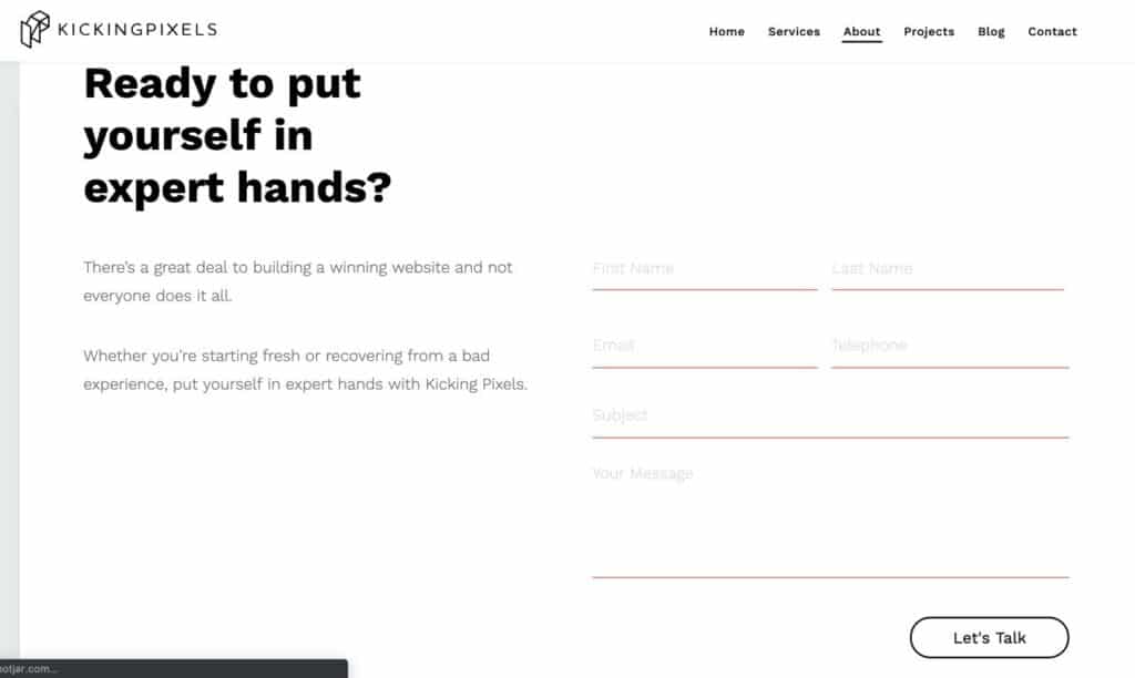
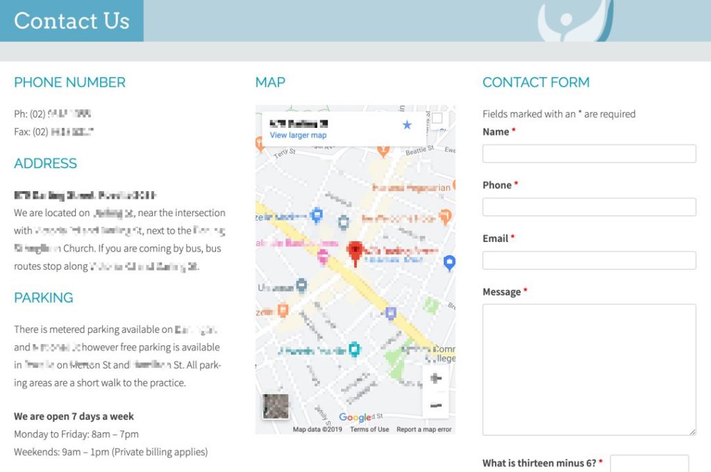
This page includes samples of two Contact Us pages with copywriting by us and one example pulled at random from the internet. Why? Because I’m often asked why the lowly Contact Us page is included in our critical website copywriting package…
Why is your Contact Us page so important?
“But it’s just for our phone number and email address. What would you write?”
That’s like Amazon saying its checkout page is “just” for credit card numbers so why would Amazon’s designers spend any time working on it when in fact…
… The checkout page is the whole point of Amazon’s business. What business would Amazon have if people didn’t checkout?
Isn’t your Contact Us page the same? Isn’t visitors contacting you pretty much the whole point of your website?
So do you just shove a contact form in their face? Or do you remind your website visitors of what you offer— a recap that will nudge more of them into making contact?

So if getting visitors to contact you is the whole point of your website, why take your foot off the accelerator when they reach your Contact Us page?
The Contact Us page marks a crucial point in your conversions — will the reader contact you or not?
Your Contact Us page has work to do in order to make sure the answer to that question is yes.
So don’t let yourself think stuff it, my prospects know what a contact form does; let’s just leave them to it.
Your website visitor has reached your Contact Us page. They’re so nearly where you want them. Keep going…
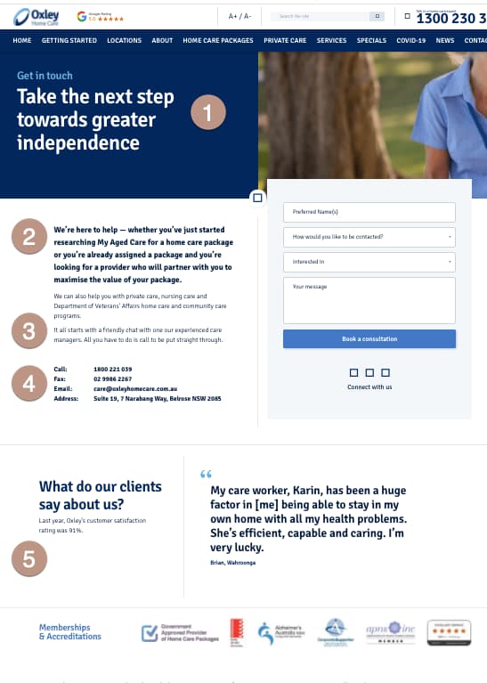
And here’s an example of how one excellent Contact Us page does just that…
5 copywriting secrets of a great Contact Us page

How to write a great Contact Us page
-
Remind them what you offer
The headline of a great Contact Us page reminds the visitor why they’re on this website. In this sample, it’s to find ways to maintain their independence. And what exactly do they need to do next to stay independent? Contact us.
-
Recap of what you can be contacted about
Just because you’re certain you want your website visitors to call you doesn’t mean they’re going to be certain you want to hear from them. This paragraph builds confidence by assuring the visitor that their call on any of the listed topics is welcome. And a more confident reader is more likely to make that call or fill in that contact form.
-
Tell them what will happen after they make contact
People are more confident about taking a step when they know what happens next. Just like a shop does better with big windows, website visitors like to know what they’ll encounter if they step into your business.
-
Multiple ways to make contact
Not everyone wants to use a Contact Us form. Some people like to phone. Some like to email directly. Cater for everyone.
-
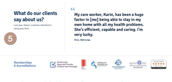
Keep on proving you can deliver
Your prospect is teetering on the brink of contacting you or walking away without ever telling you they were there. This is not the time to take your foot off the accelerator. Keep proving you can deliver. Think facts about your performance, social proof like testimonials, stamps, seals, industry association memberships. Whatever you’ve got.
So which of the three Contact Us pages discussed on this page is most like your site?
If it’s the one with nothing but contact details, you’re looking at a major opportunity to improve your conversion rate on the lowly Contact Us page.
Check out our other conversion rate optimisation (CRO).


